Pixcel was the first UI/UX project that I've ever had. At first, I struggled to develop what I wanted to create for it. The first thoughts I had were:
- An app that allowed users to see local lemonade stands near them. (It was a simple concept, but it brought up a moral gray area, so I decided it was best not to go there for my first project.)
- A redesign of the Google results page (Once again, a simple concept, but this time, it seemed to be a bit much for my first ever UI/UX project. It also brought the possibility of me not making a better layout, so I figured it could be a project that I save for later once I get more experience underneath my belt.)
- A website for Kean University's eSports team. (I had the most passion for this idea since I had been a part of the eSports program for almost a year by then. But the problem was actually the opposite of the last two, where I felt like I didn't have a big enough idea. It also didn't fit the realm of an app on a mobile device. So, once again, it felt that it would be a better project for later.)
Mood board of initial app ideas.
So, I was struggling to come up with an idea. I knew I wanted to do something related to eSports because I had the most passion for it. I started to think about what I had to do later that day, and that's when it hit me:
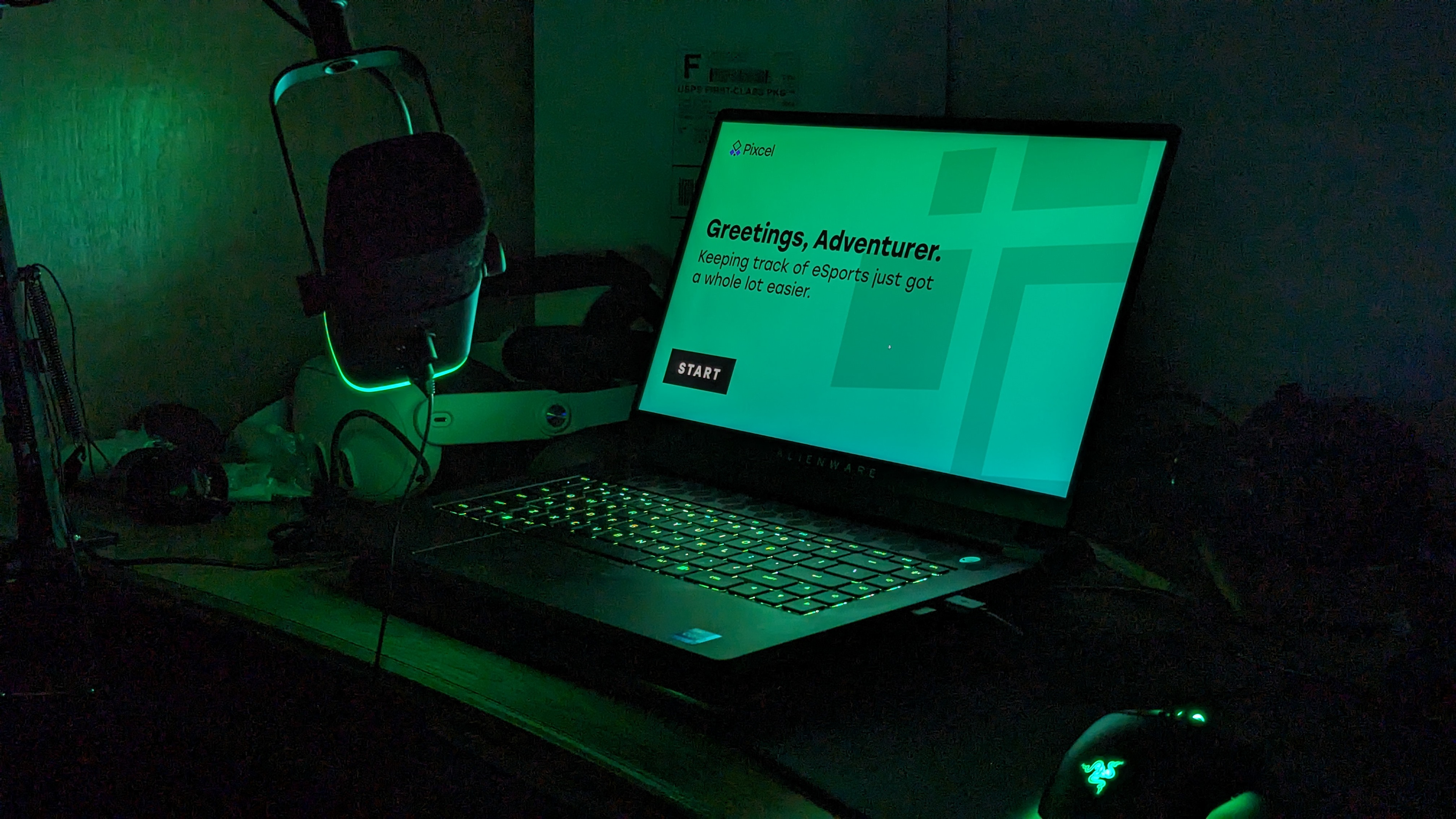
There were a lot of different websites I had to use to keep up with everyone else score and lineup-wise. And it was typical of me to forget which website I needed to go to do a specific action. It got me thinking about how easy it would be to just have a central website to go to.
That's when I realized that I now had my UX project.
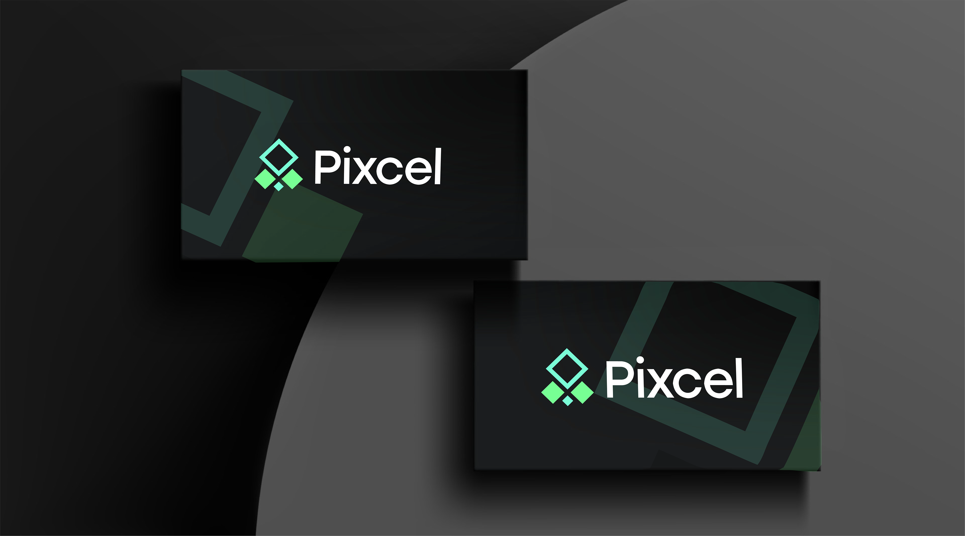
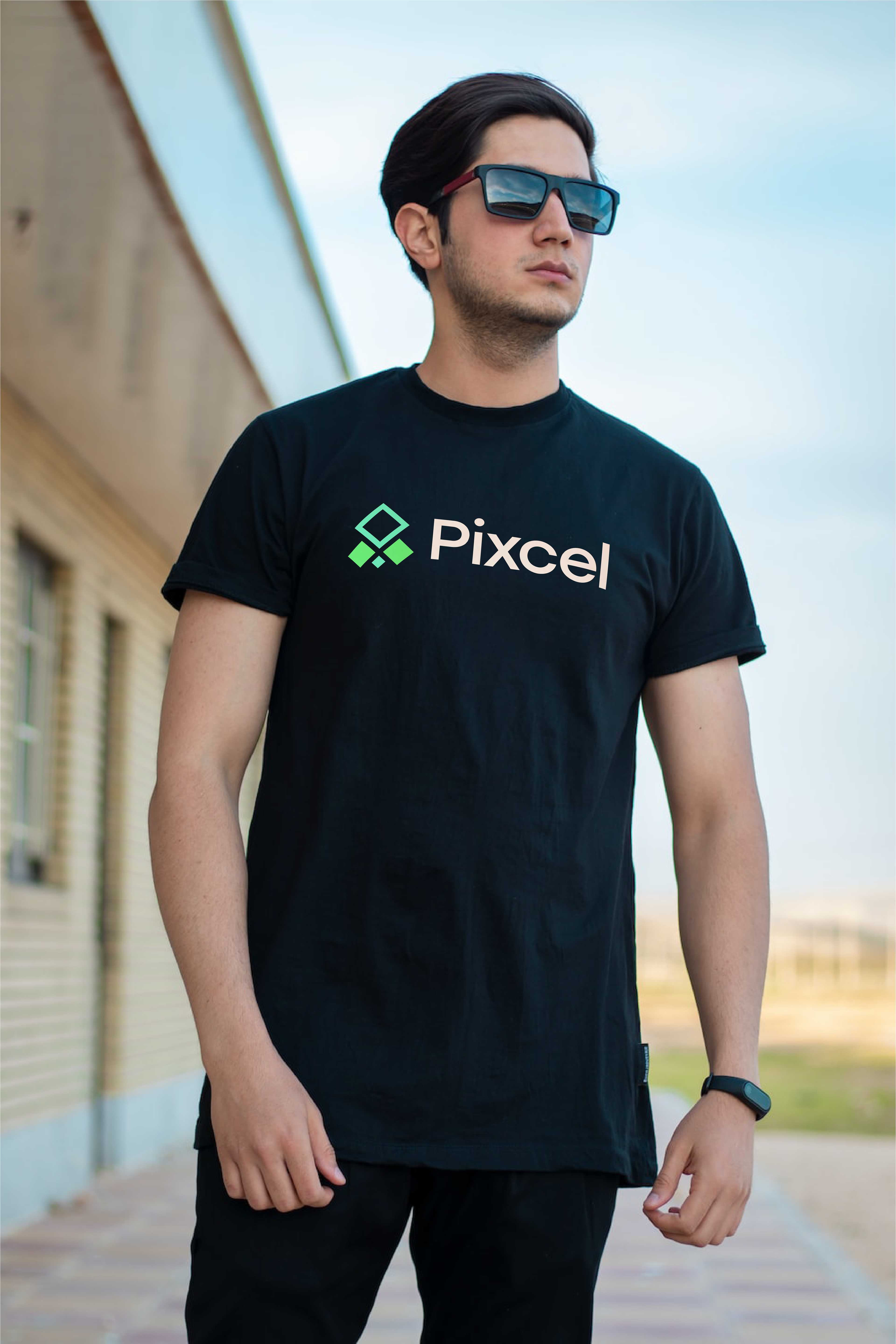
I first started on the logo. I came up with the name "Pixcel" from Microsoft Excel since it's known to be an organization tool, and also the word pixel, which is widely associated with video games. My first logo was a pixel accelerating, and I came up with the color palette from the traditional red VS. blue competition colors. I added purple as a bit of a transitional color. However, it felt a bit too "gamery" and I wasn't a big fan of the color palette.
After a bit of tinkering with my shape, I really liked how the logo looked on a 45 degree angle. It gave it a bit of 3D depth, and after a bit of more tinkering with the font and colors, I ended up on my final design.
Pixcel Project Philosophy
Walkthrough Video of Pixcel Prototype
